Gerard Unger, typographic designer, born 22 January 1942, died 23 November 2018. Obituary in the Guardian. See his brief but beautiful website at www.gerardunger.com where he explains what he was aiming at in his alphabets.
The typeface M.O.L., for example, of 1974, was made for the Amsterdam metro, its design prompted by the fact that much of the signage would be read by the light of fluorescent tubes within; “the principles of optics were taken as the basis for the design.”
Unger footnotes that: “Mol is the Dutch word for a mole. The work group had come up with the idea of a mole as a mascot for the new underground railway. Outside every station in the city there would be a giant molehill with a mole pointing the way to the entrance with his nose. The idea was torpedoed by the city authorities, but we let it live on in the name of the typeface.”
Here you can find another alphabet, K. B. Sandved’s, Nabokovishly written out in the wings of butterflies.
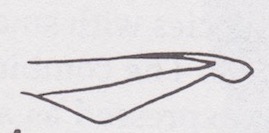
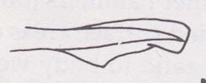
And in Sharks: an introduction for the amateur naturalist (Sanford A. Moss, 1984), you can find an alphabet created by K.S. Thomson and D.E. Simanek, in their article ‘Body form and locomotion in sharks’, American Zoologist 17 (1977).

Ok, it’s really a labeling system to enable distinction between different caudal fin shapes, but it looks like sharks trying to spell something out for us.